Overview
DEER Design is my personal brand identity created to represent my design philosophy and connection to the Pacific Northwest. The logo combines iconic elements of the region—deer antlers and Mt. Hood—with a clean, modern aesthetic. The project showcases my full design process, from initial sketches and concept exploration to digital refinement and motion animation. The teal color palette (#134f5c) is inspired by the natural landscapes of the Pacific Northwest, creating a calm yet professional visual identity.
Design Process
1. Inspiration & Research
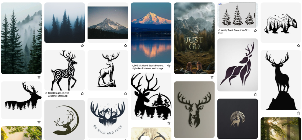
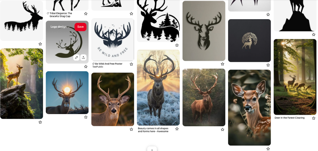
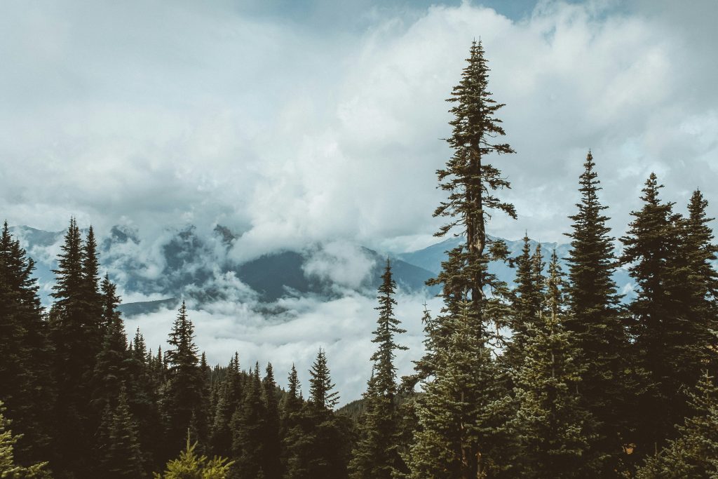
I started by collecting visual references that captured the essence of the Pacific Northwest—deer, mountains, forests, and natural landscapes. I wanted the brand to feel grounded, professional, and connected to nature. These mood boards helped establish the visual direction before I began sketching.
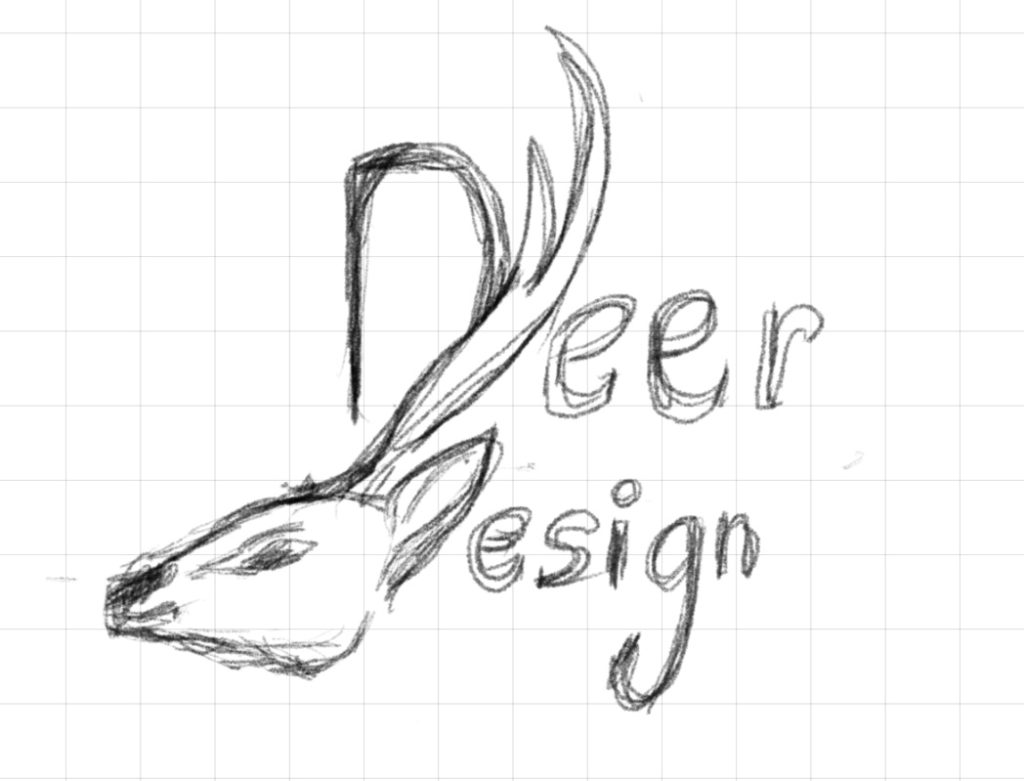
2. Initial Concept Sketches
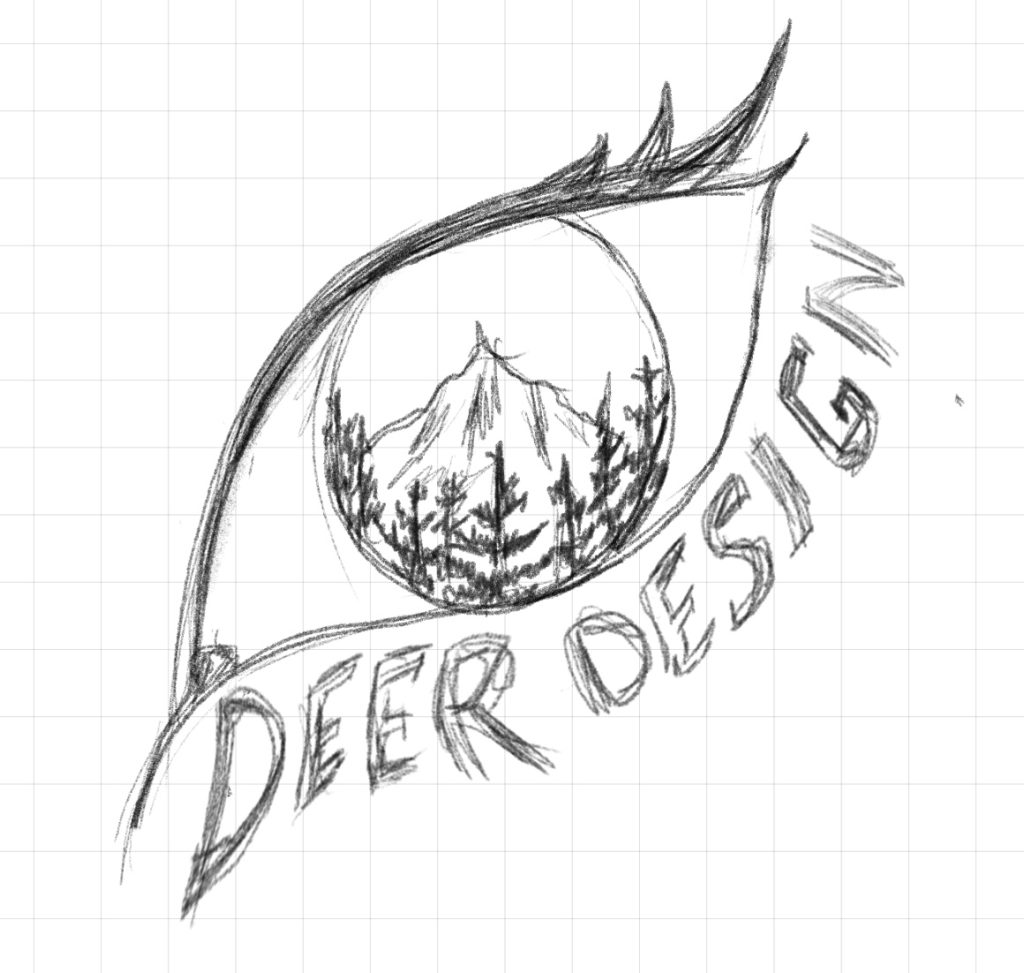
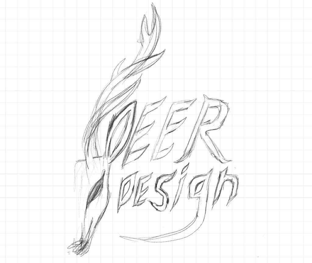
I explored multiple concepts through hand-drawn sketches, testing different compositions of deer antlers, Mt. Hood silhouettes, and typography treatments. This phase was about rapid ideation and discovering which visual elements worked best together. I experimented with deer profiles, antler shapes, and ways to integrate the mountain.
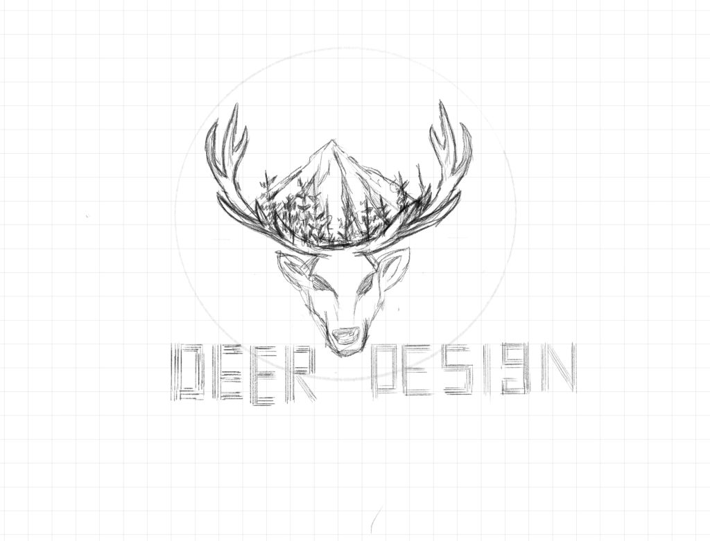
3. Concept Development
After reviewing my initial sketches, I selected the strongest concepts and created more refined compositions. I focused on the antler-with-mountain concept and the “DEER DESIGN” typography with decorative elements. This stage involved testing different arrangements and proportions to find the right balance.
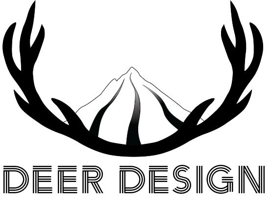
4. Digital Refinement
Overall, the design looks good, but the trees and the mountain’s hatching details might make it difficult to use or print at smaller sizes.
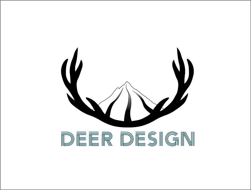
5. Color Palette Development
I developed a color palette centered around the signature teal (#134f5c) inspired by Pacific Northwest waters and forests. I explored complementary earth tones and tested how the colors would work across different applications. The palette needed to feel natural, calm, and professional.
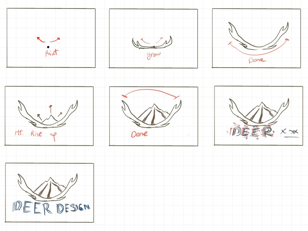
6. Storyboarding for logo animation
I originally wanted to include trees and have the mountain appear like a stamp on the screen, followed by the rest of the animation. But after receiving all the feedback and reflecting on it, I decided to make some changes; removing the trees to keep it simpler and follow the “less is more” approach. So, I created another storyboard based on this new direction.
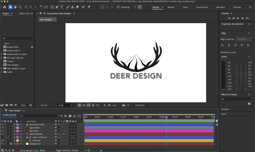
7. Motion Design
To bring the brand to life, I created a motion animation in Adobe After Effects. The animation reveals the logo through smooth transitions and subtle movements, perfect for presentations, website headers, and social media. This adds a dynamic dimension to the static brand identity.
Outcome
The final DEER Design brand identity is a comprehensive visual system that reflects my design values and regional connection. The project demonstrates my ability to move from concept and research through sketching, digital refinement, and motion design. The teal color and iconic Mt. Hood-antler logo create a memorable, professional identity that stands out while maintaining a calm, natural aesthetic.
Tools Used
- Adobe Illustrator
- Adobe After Effects
- Adobe Photoshop
- Hand Sketching on Procreate