Overview
This project is a UX and app design concept. The idea was to design a coffee shop app that allows users to order coffee, select a book, and combine both into one calm and cozy experience. The app focuses on relaxation, simplicity, and ease of use, inspired by the feeling of enjoying coffee and reading in a quiet space. I chose the Coffee & Book App because it allowed me to focus on user experience, visual comfort, and lifestyle design.
Design Process
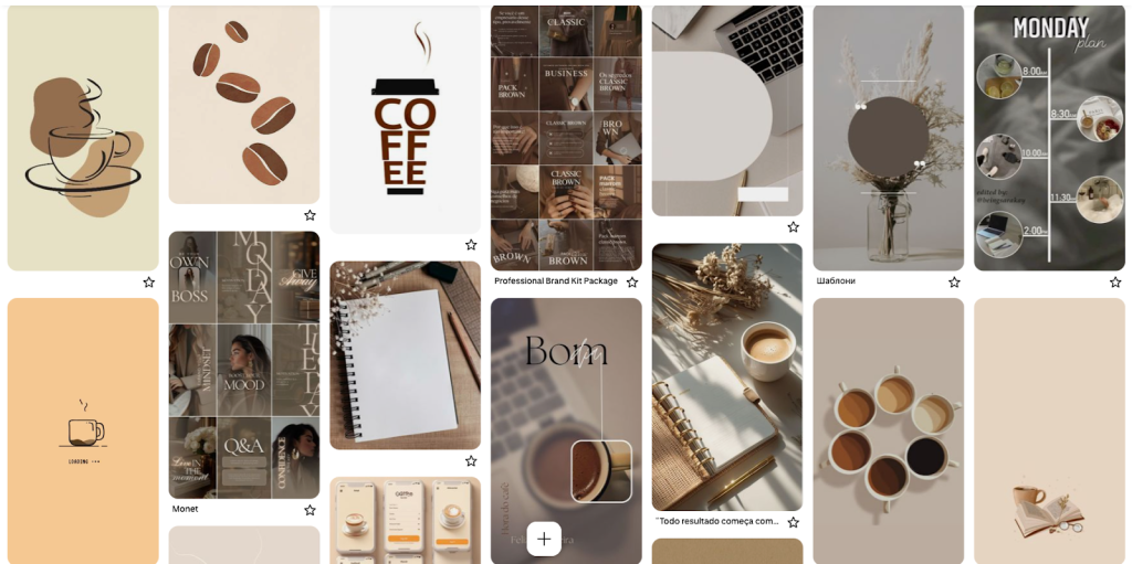
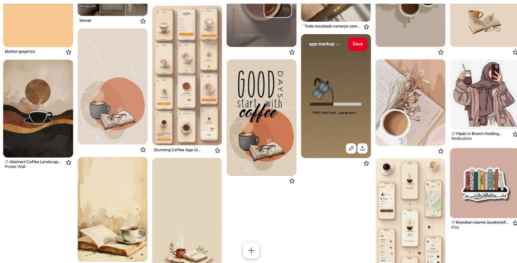
1. Visual Research & Inspiration
I collected visual references centered around coffee, books, warm interiors, and calm environments. These references helped guide the overall mood of the app toward a cozy and relaxing experience.
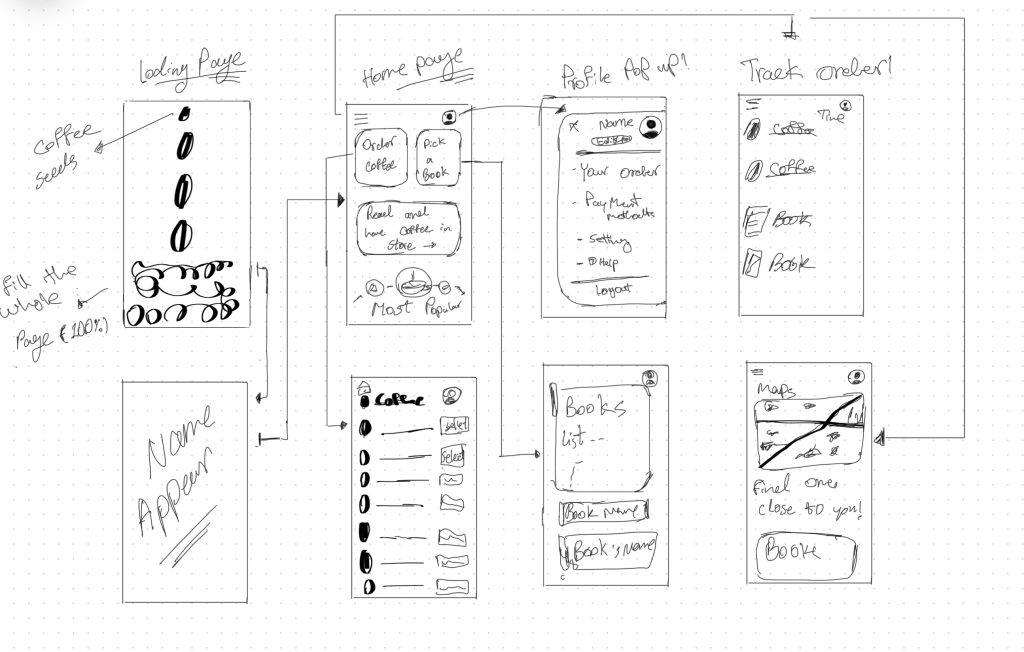
2. Wireframing & User Flow
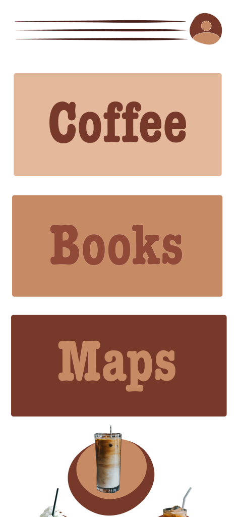
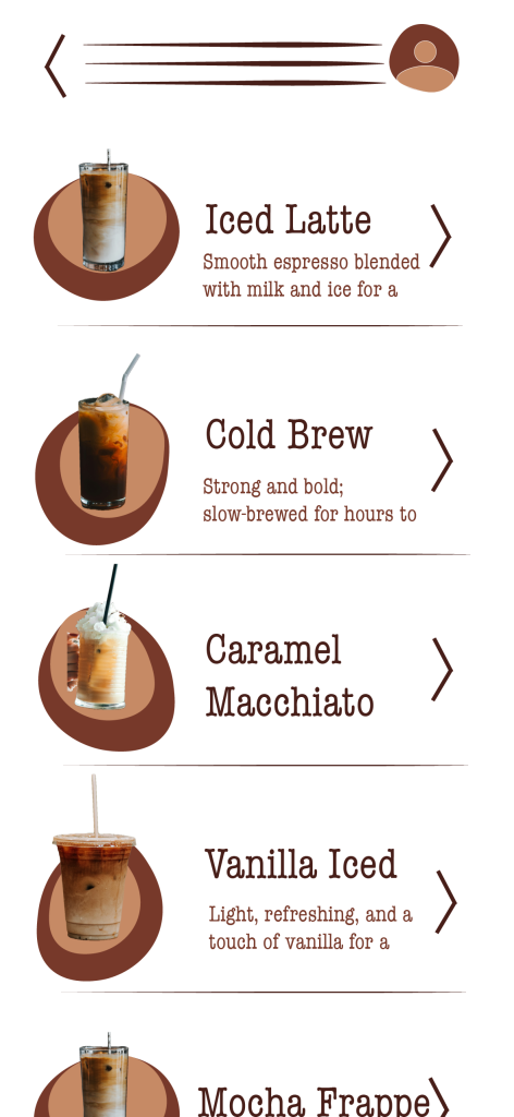
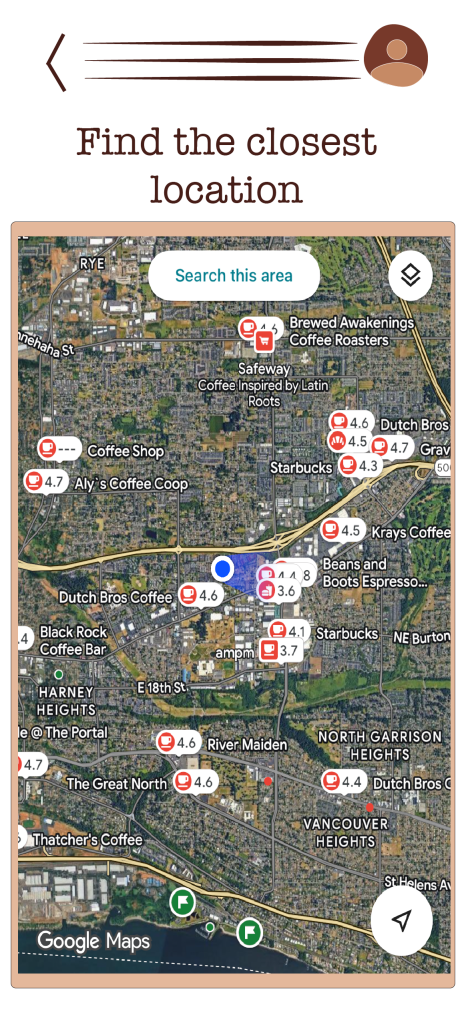
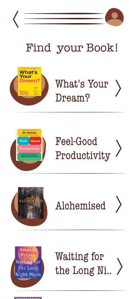
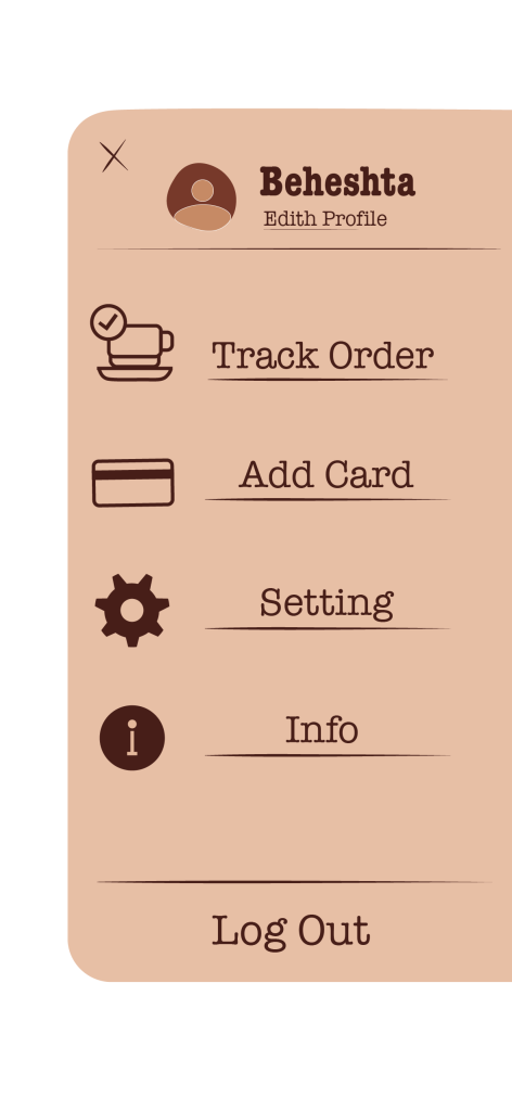
I created low-fidelity wireframes to plan the app structure and user flow. This included screens for onboarding, home navigation, coffee selection, book selection, maps, and order tracking. The goal was to keep navigation clear and intuitive.
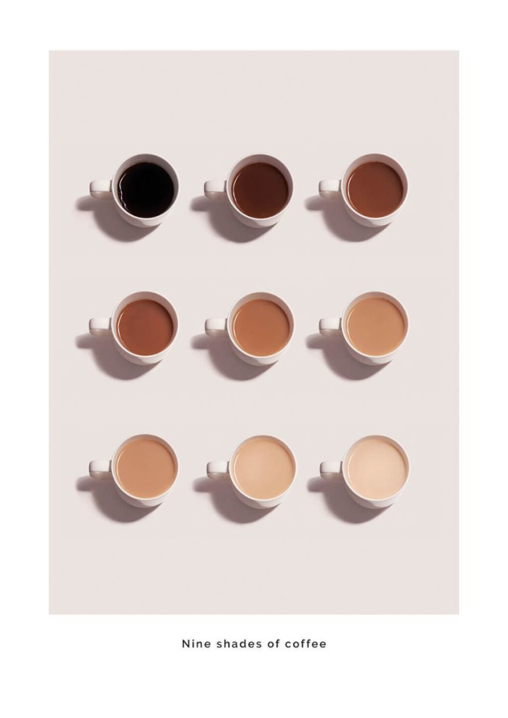
3. Color Palette
I selected a warm brown color palette inspired by different shades of coffee. This choice was intentional to support a cozy atmosphere and maintain visual consistency throughout the app.
4. Typography
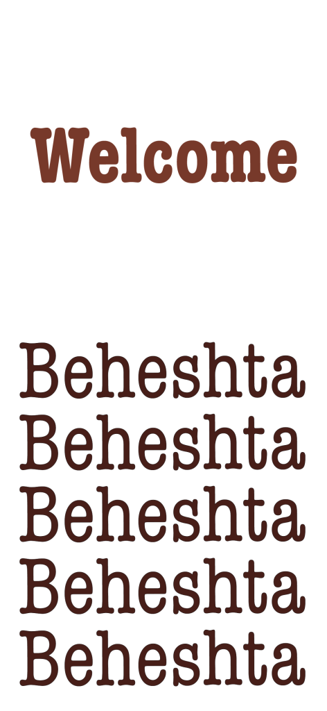
I tested several fonts and chose American Typewriter for body text and American Typewriter Condensed for headings. These fonts supported readability while reinforcing the classic and warm tone of the app.
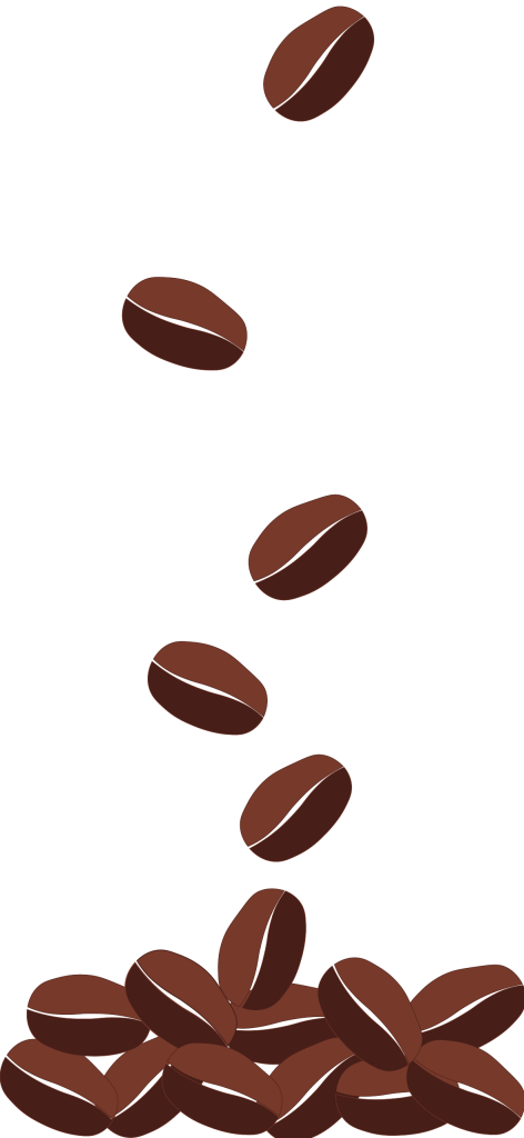
5. Asset Creation
I designed custom visual assets, including icons, coffee beans, interface elements, and menu layouts. All assets were created to stay consistent with the color palette and overall visual direction.
6. Feedback & Iteration
I received peer and instructor feedback focusing on clarity, contrast, and usability. Based on this feedback, I adjusted button contrast, simplified icons, refined navigation arrows, and improved spacing to make interactive elements clearer.
7. Motion & Animation
So I had to learn everything and try to make it work based on what we learned in class and the materials on Canvas. I was finally able to get the project going. First, I imported all my assets into Adobe After Effects. Then I made sure the assets that needed animation were each on their own layer. I started with the first page, which was the dropping coffee beans. At the beginning it was really hard because I didn’t know where to start, so I watched a YouTube video about how to animate falling beans, and guess what — it actually helped me understand it better.
After that, I got more comfortable and started working through the animations one by one.
Here’s how I built everything:
I made the first main composition sized for the iPhone 16. Then I created some micro-interactions in separate compositions inside that main one. When I finished all the small compositions, I brought them together into one single composition so everything worked as a full sequence. After that, I made a new screen-size composition, added the iPhone 16 frame, masked it, and placed the full animation inside the phone. I styled the background, and then I was finally able to export it as a video.

Outcome
The final result is a polished app mockup and motion prototype that demonstrates UX thinking, visual consistency, and interaction design. The project shows my ability to move from concept and wireframes to visual design and animation while responding to feedback and refining usability.
Tools Used
- Adobe After Effects
- Figma
- Procreate
- Adobe Illustrator
- American Typewriter Font